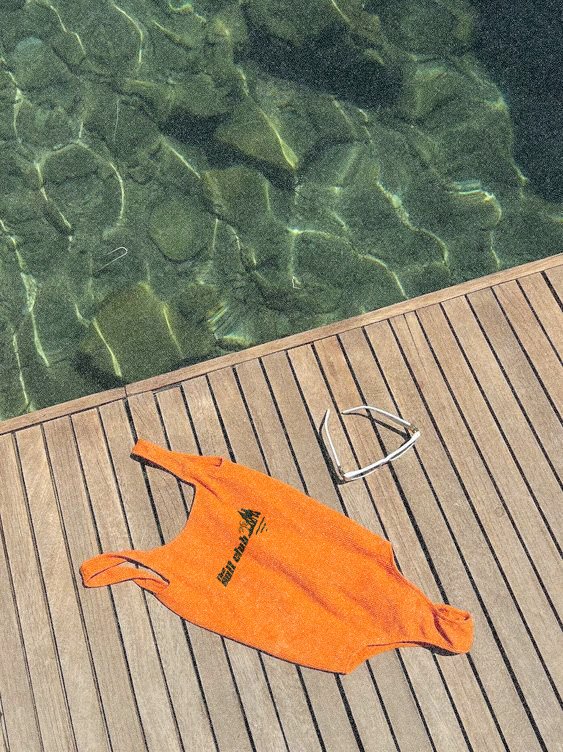
The Salt Club is a dynamic swimwear brand that redefines durability and style for surfers and adventurers alike. This project highlights a cohesive visual identity, merging sporty sophistication with minimalist design. Inspired by the ocean’s strength, the branding communicates a lifestyle that thrives in and out of the water.
The Salt Club
The Salt Club: Where Urban Edge Meets Ocean Resilience
Through bold typography, vibrant color palettes, and creative packaging, the visuals embody the essence of resilience and freedom.
Where Design Meets the Spirit of the Sea
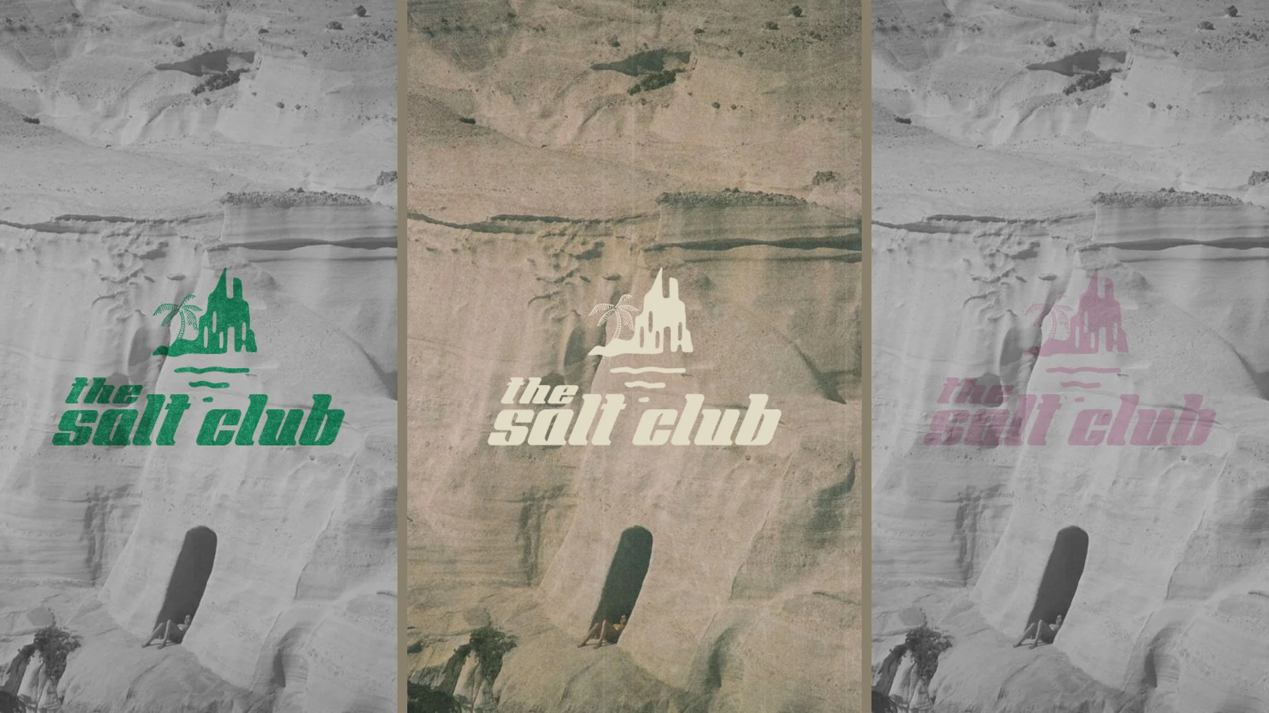
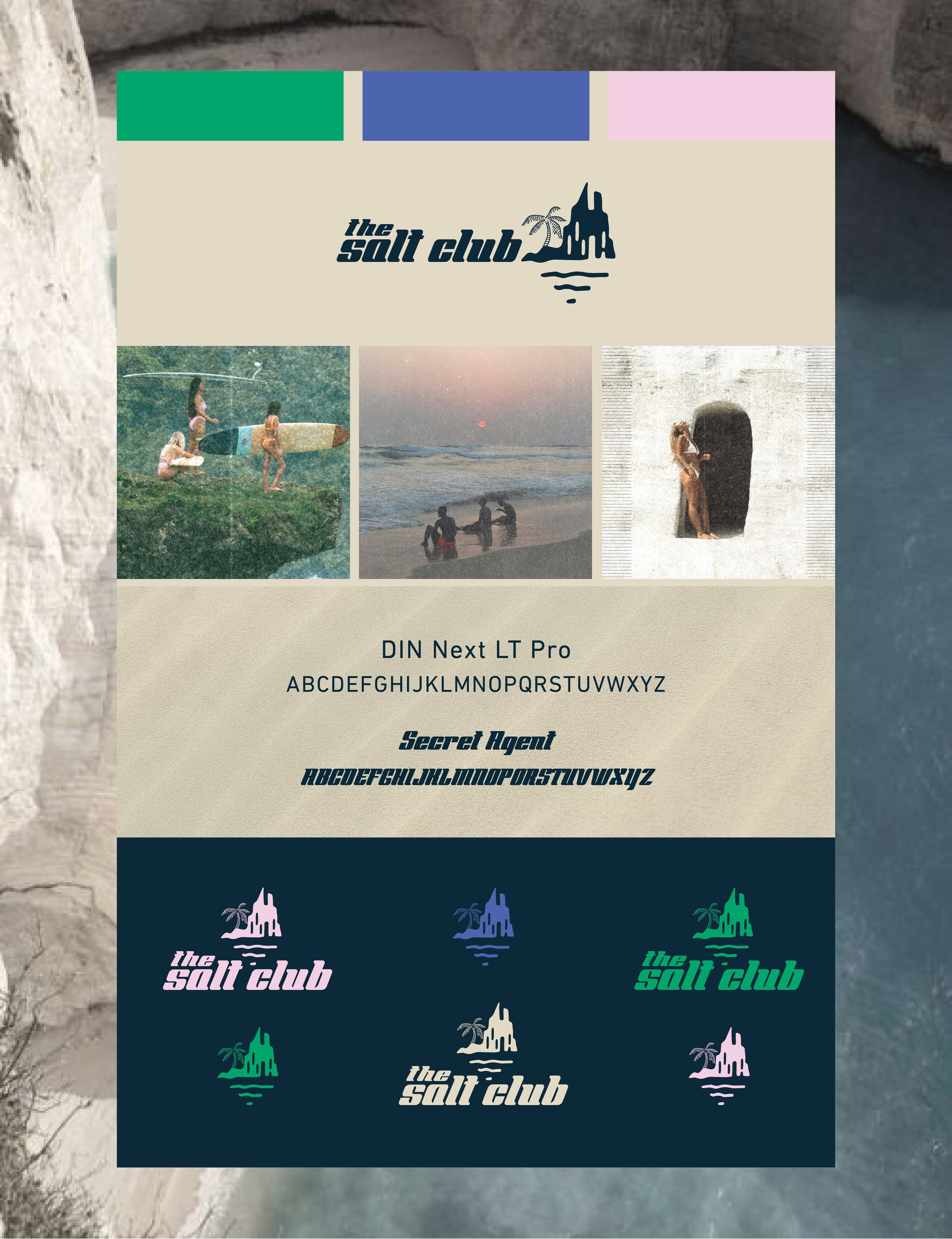
When designing The Salt Club, I wanted to create a visual identity that reflected the raw beauty, strength, and sense of freedom inspired by the ocean. At the heart of the brand is the logo, which draws its unique silhouette from Sarakiniko Beach in Greece—a place known for its otherworldly, chalky-white rock formations and crystal-clear waters. These natural elements provided the perfect muse for a design that speaks to adventure and resilience.
The logo’s abstract depiction of a coastal landscape, paired with a subtle palm tree and flowing water lines, captures the essence of The Salt Club. It’s home to those who seek both thrill and tranquility in the waves.
Throughout the project, I focused on merging minimalist design with bold, sporty typography to create a brand that feels versatile and inclusive. The color palette—a mix of sun-kissed neutrals, deep blues, and vibrant accents—reflects the vivid personalities of its members.
A Coastal Identity Shaped by Adventure and Diversity
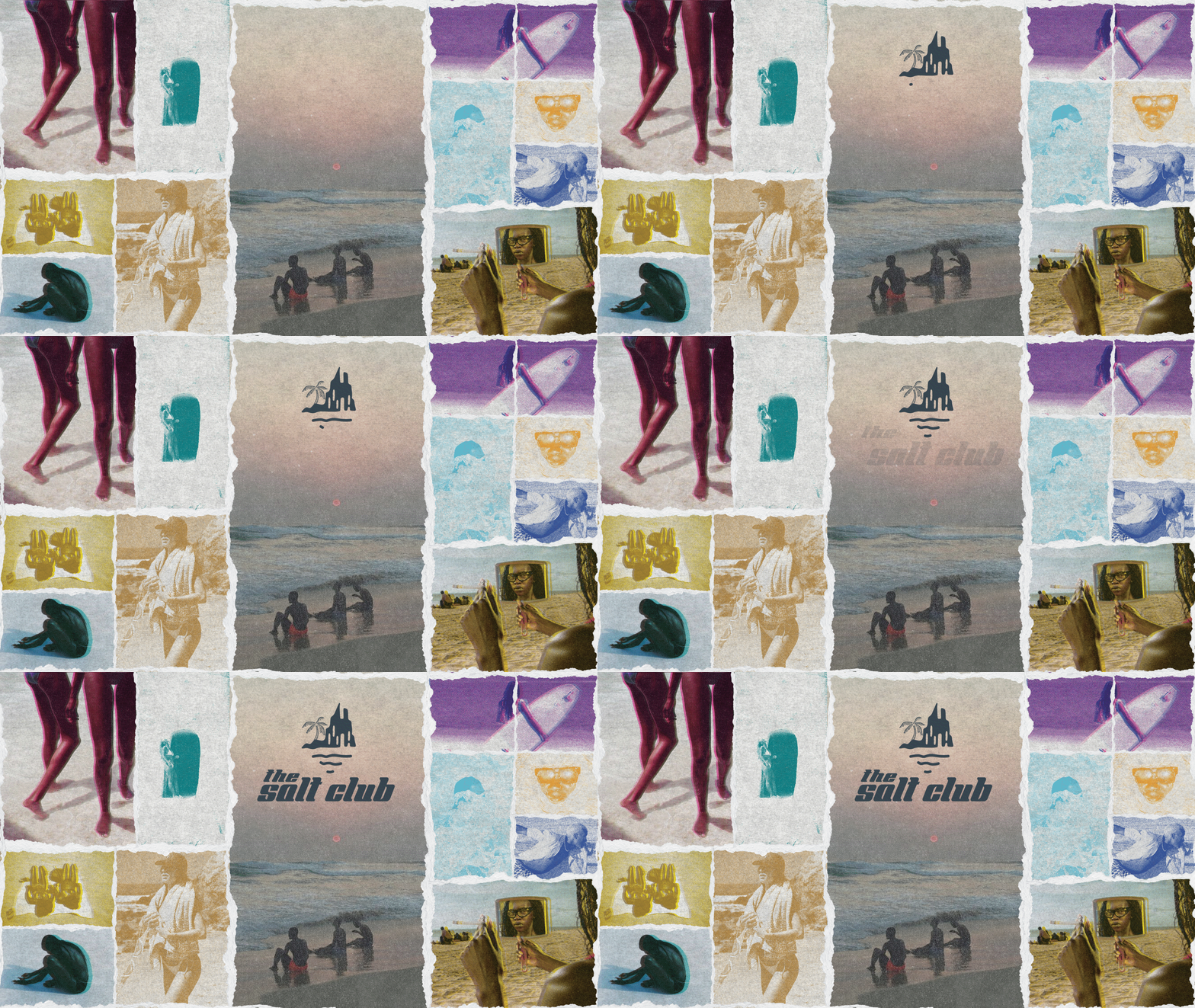
The photography for The Salt Club captures an authentic, sun-drenched aesthetic that feels effortless and raw. The images reflect candid moments of joy, connection, and reflection, mirroring the spirit of the brand: vibrant, inclusive, and unapologetically adventurous. The brand embraces the strength and beauty of all people of color, showcasing a vibrant tapestry of cultures and identities united by a love for the ocean.
The Salt Club speaks with a tone that is confident yet approachable, blending an adventurous edge with a welcoming warmth. It’s a voice that invites everyone to embrace the strength of the ocean and the freedom of self-expression. Key phrases like “Dive into Freedom” & “Embrace the Strength” underscore the brand’s ethos, encouraging a sense of empowerment and belonging.
Candid Moments, Bold Textures
The risograph-inspired treatments amplify this aesthetic, adding layers of texture and depth that evoke a sense of nostalgia while maintaining modern edge. The imperfect grain, bold color overlays, and halftone patterns give the imagery a tactile, artful quality—like postcards from an unforgettable summer. These effects not only highlight the brand’s playful and creative essence but also align with its commitment to sustainability and individuality.
A Seamless Coastal Experience
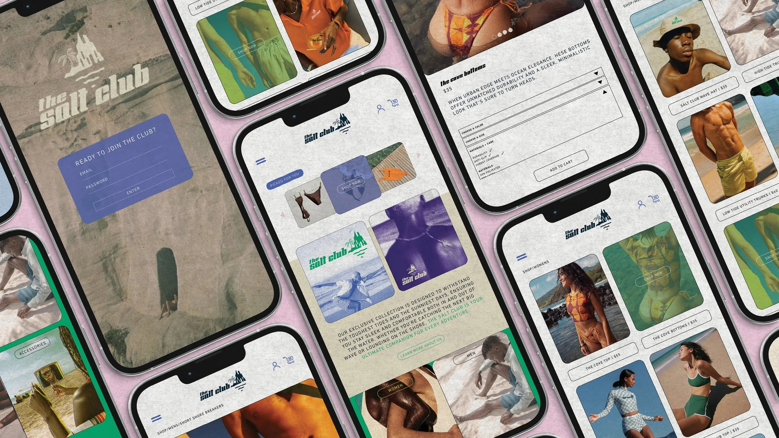
The website for The Salt Club was designed to feel like a seamless extension of the brand's ethos: vibrant, inclusive, and natural. Every element was thoughtfully crafted to echo the balance of boldness and simplicity that defines both the products and the people who wear them.
From the moment you land on the homepage, the journey feels intuitive and inviting - Are you ready to become part of a lifestyle rooted in strength, freedom, and individuality?
The navigation is simple, with clear categories like Women, Men, and Unisex, making the collection easy to explore. Interactive elements, such as "Picked for You" suggestions and shop-now highlights, mirror the personalization of a beachside boutique. Recognizing the on-the-go nature of the audience, the mobile version of the site is just as immersive. The responsive design ensures the site adapts seamlessly across devices, whether they’re on a laptop at home or scrolling from the beach.


